

CHALLENGE:
DP World is a global transportation company that organized fleets of ships and ground vehicles. Their existing website was hard to navigate and understand. Corporate would need to explain gate, shipping, truck and rail schedules to clients and existing excel spreadsheets were hard to decipher.
SOLUTION:
DP World’s website had a lot of repeating information, and other valuable information buried within the site. The best mode of action was to understand what pages users frequented the most, and what information they were looking for. User personas helped in this situation so we could better understand what was important to the users, especially those getting lost in the site. Once key pages were identified, we streamlined the flow to reach them. This presented a successful and efficient experience.
RESULT:
My experience with SEO/SEM was utilized to best identify pages of redundancies, and pages that could be consolidated and economized. The simplified user flow got users where they wanted to go without any confusion. User traffic increased, and bounce rate deceased. DP World’s expectation was exceeded, especially with my role as the lead product designer. Once the UX/UI was signed off and completed, I oversaw the website population on Wordpress by managing a team of web developers. The design was respected, and the client was happy with the outcome.


For the user personas, I relied on archetypes and tied it back to the company.
Archetype:
The Ruler: Creates order from chaos. The ruler is typically controlling & stern, yet responsible & organized. DP World must organize a fleet of transportation ships and vehicles.
The Caregiver: Protects & cares for others, is compassionate, nurturing & generous. DP World is proud of their sustainability efforts, student co-op & diversity opportunities.
The Innocent: Exhibits happiness, goodness, optimism, safety, romance & youth. DP World’s transportation services connects people. It helps build a global village where everyone is easily connected.


BRAINSTORMING
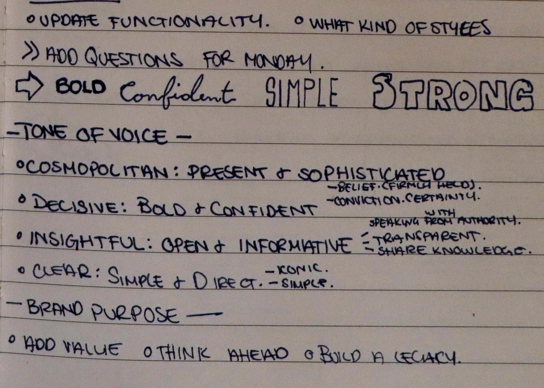
Whenever I begin a new project, I ask as many questions as I can. Getting an overall concept off the bat is important to understand what general direction I should head into.
During the kickoff meeting with DP World, one of the most striking things that jumped out at me were the words: Bold, Confident, Simple and Strong. The client wanted the website to last for years.
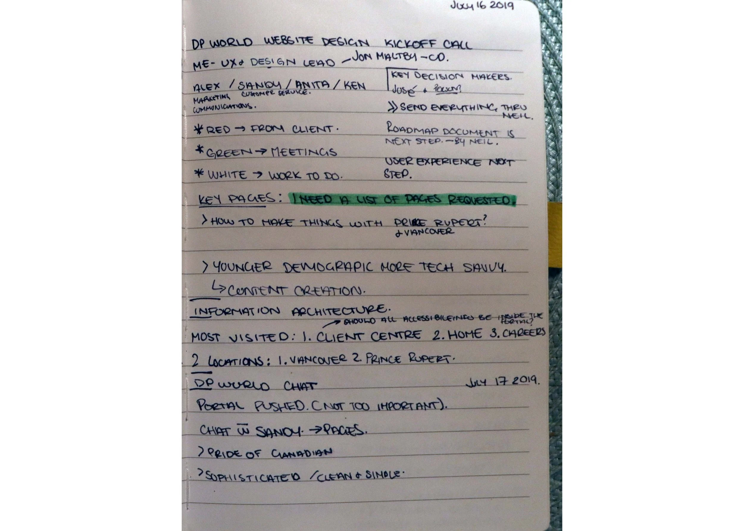
My first instinct was to inspect the current website they had, and determine what were the key pages. The pages that saw a lot of traffic, the pages that can be removed or consolidated, etc. Taking that information I began to sketch up some preliminary wireframes.
SITEMAP
The sitemap and Information Architecture plots out how the user will navigate through the website.
It includes the the global navigation, footer, and site content.
I made this template using Visio.


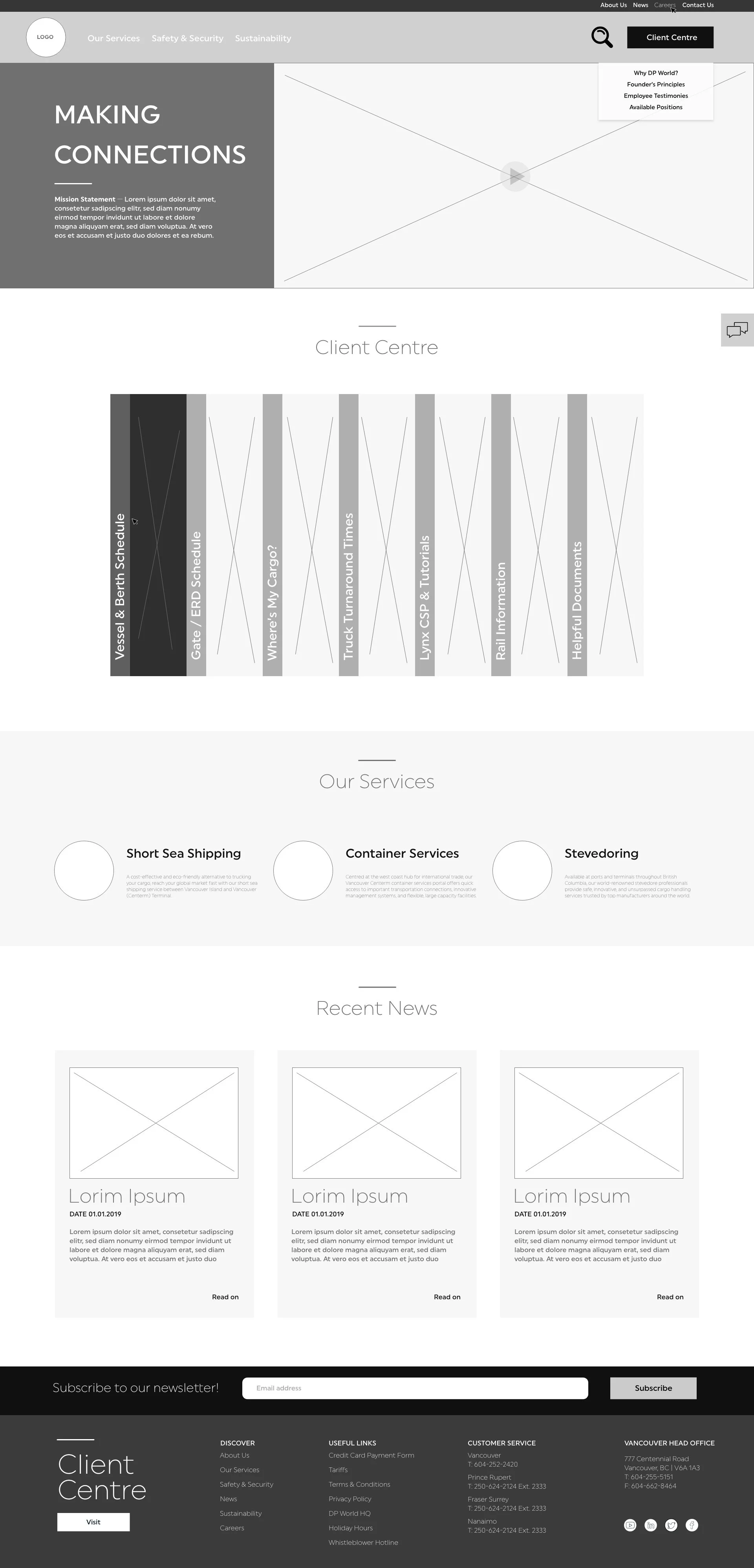
HOMEPAGE UX
Here you can see the evolution of the homepage as the design goes through revisions.
Though I am proficient in a majority of prototyping software, I decided to use Adobe XD for this project solely for the file sharing capabilities.
It is simpler and faster, in my option, to import icons and photography from Illustrator and Photoshop.
The homepage design’s evolution begins with a truck being loaded. DP World is a global transportation company. It uses ships, trains and trucks to transports goods for their clients. The headline was “Making Connections”. My head went to literally making a connection. I believe the brain works on several levels. If you can appeal to a word in several ways, memory by association may be invoked.
Making connections talks about the company connecting their clients to their customers. The way they do that is through transportation. I envisioned a parallax between a shipping container being loaded on a truck.
The client wanted the design simpler, so you can see the progression from right to left.
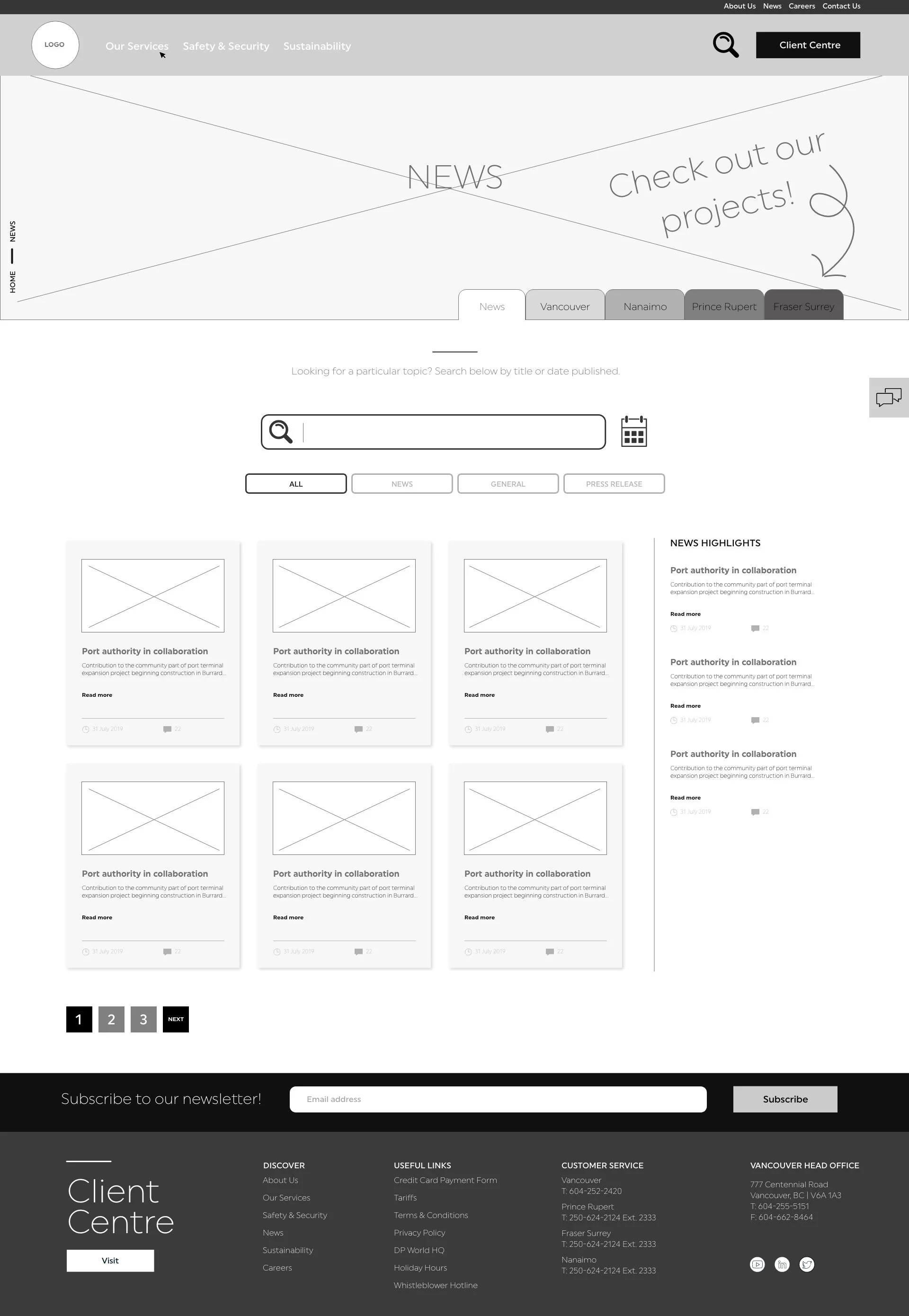
NEWS PAGE UX
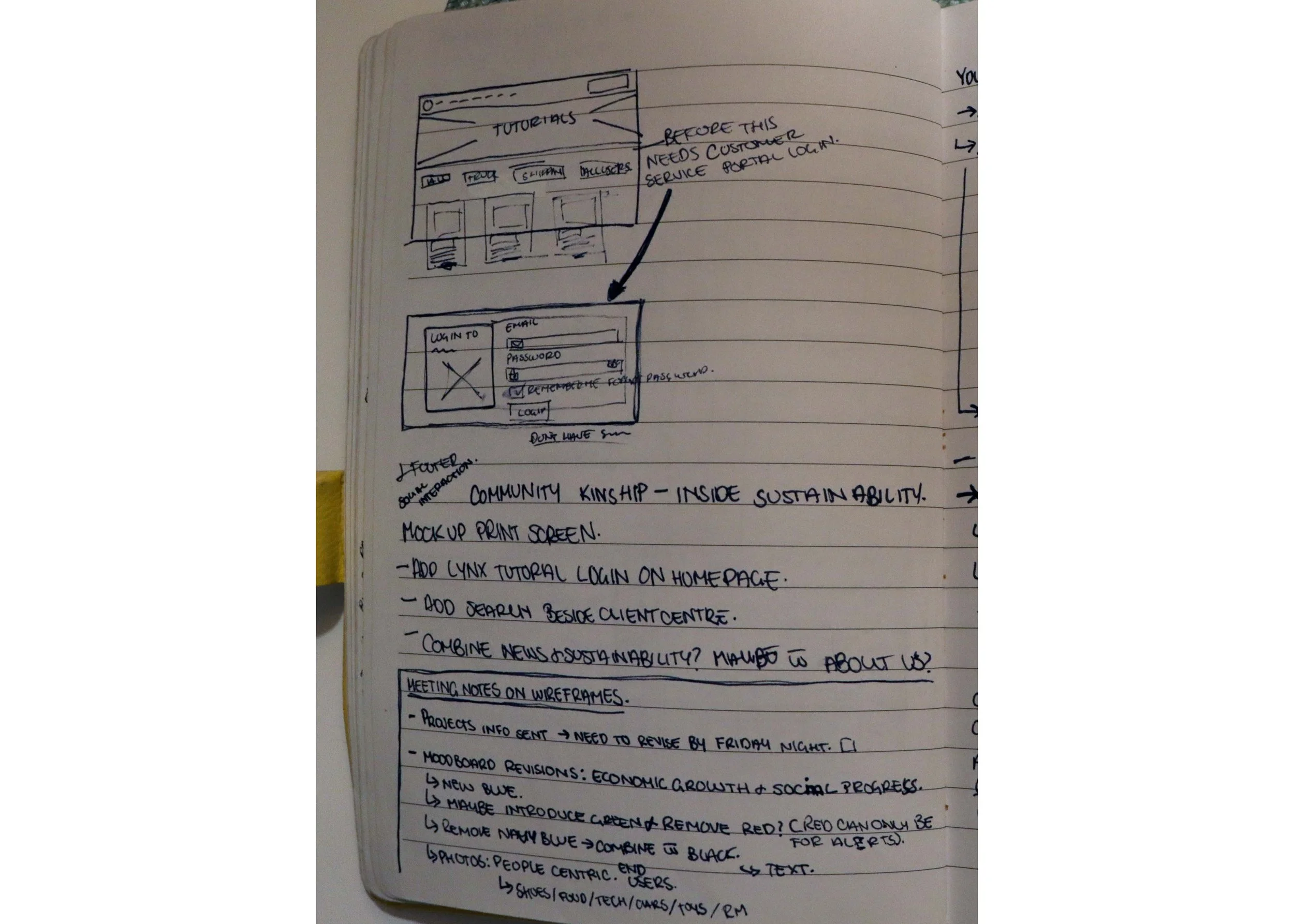
The issue was this page needed to house both News and Projects in an organized way.
I needed to create a filtration system, and thought of a filing system. As a visual person I literally thought of folders, and created a tab feature on the news/projects pages. They were their own separate pages for SEO, but looked and functioned together as one.
Initially the projects were shown as locations on the tabs, but soon realized this gets cluttered fast. I created a News and Projects tab. The News tab held general news, press releases and community kinship.
The projects page would be organized by location.


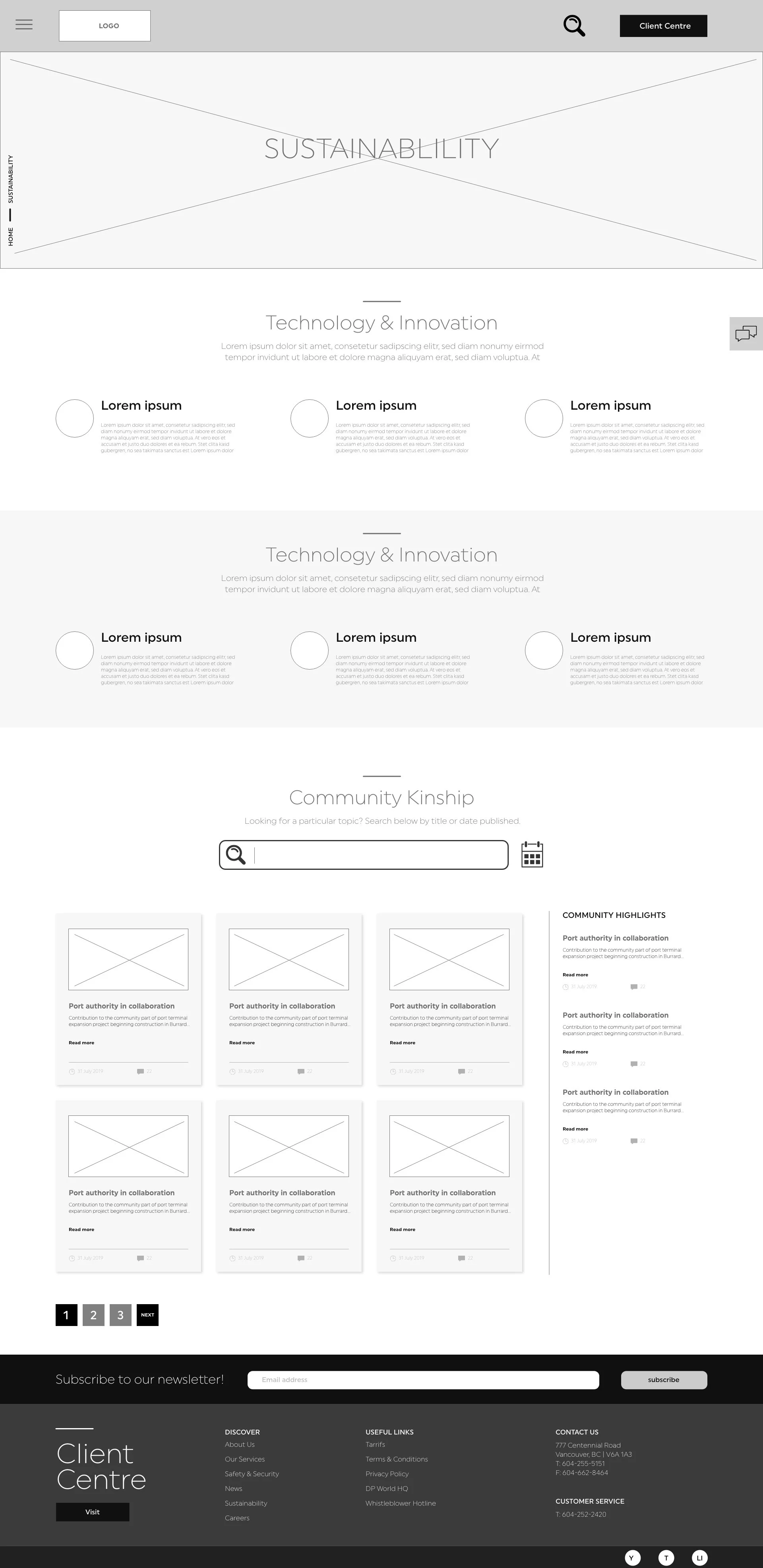


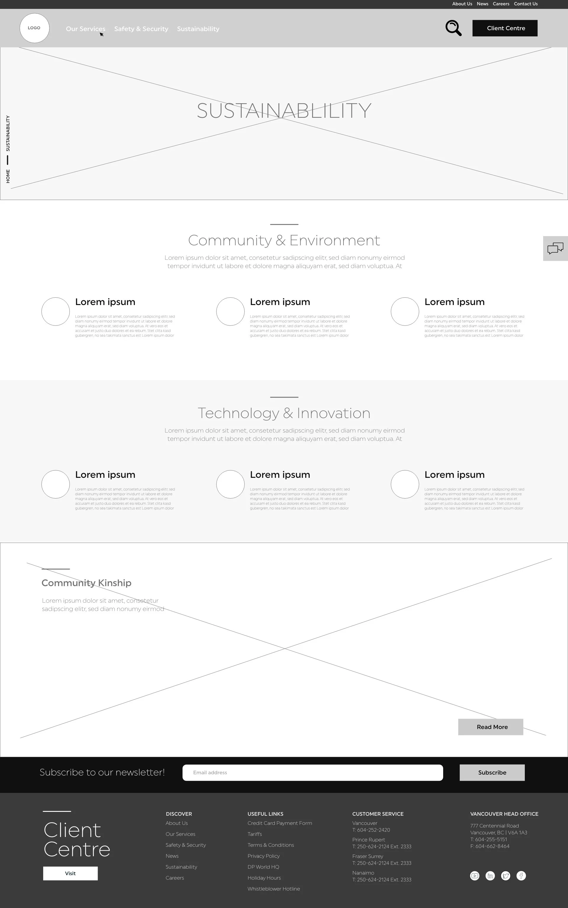
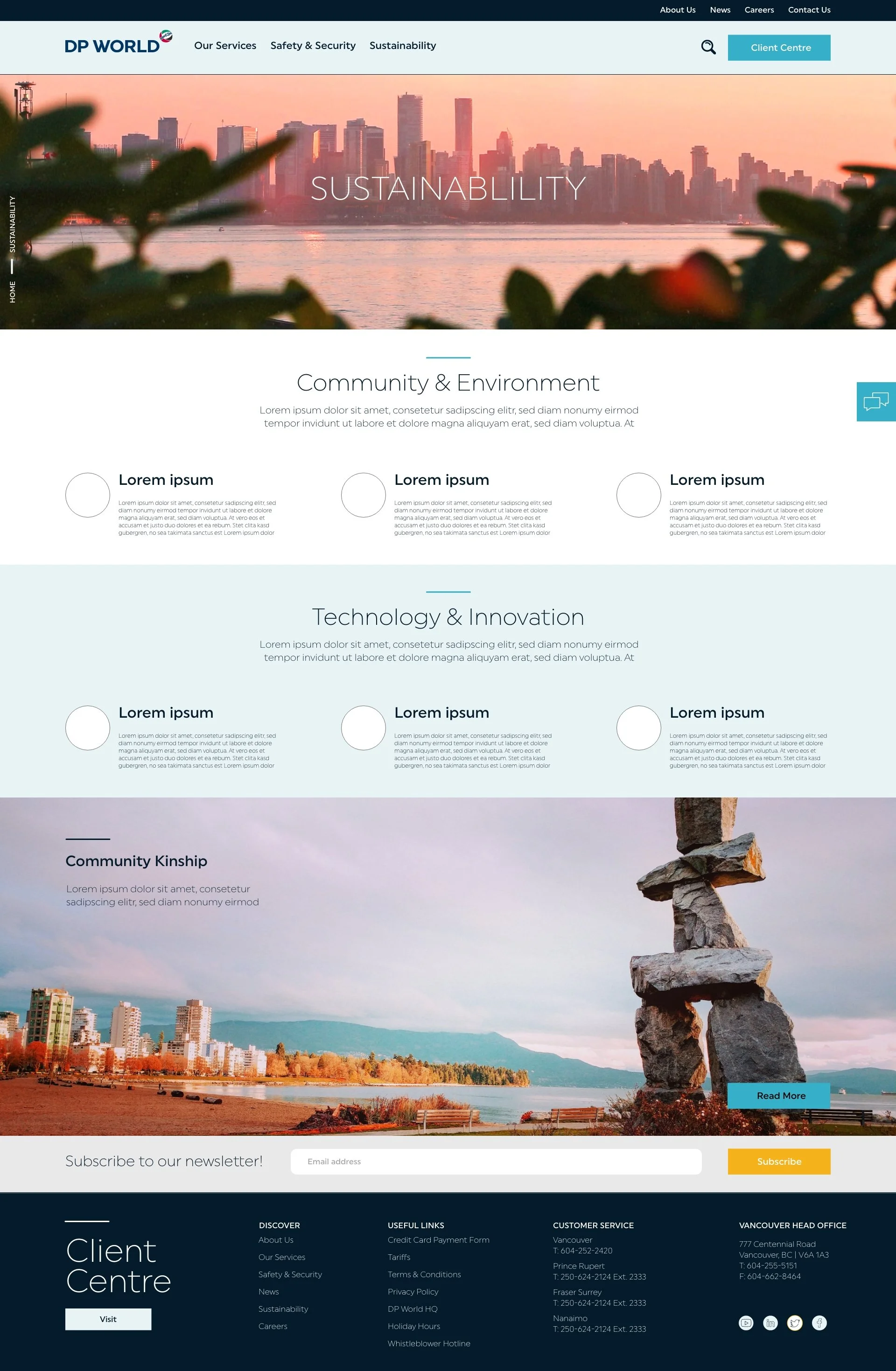
SUSTAINABILITY PAGE UX
Initially Community Kinship was on the sustainability page, but ultimately decided to just show a module where it links back to the news page with the tab open.
GLOBAL NAV
I decided to use a two tier navigation system to showcase the information. This way, the information was more deliberate.
Our Services, Safety & Security and Sustainability are likely the first pages users will see and interact with. The site analysis showed these pages were most frequently visited. Therefore we made it easy to get to them.
About us, News, Careers, and Contact us were still very important, so I put it above the most important page of all — Client Centre.
UX USER FLOW
Here is a video of the user flow on the initial UX iteration. The final designs updated the client centre module. When the user hovers over a specific Client Centre topic, a description expands. In the case for mobile, the user would have to tap on the topic.


LETS COMPARE
This was the first attempt at the UI. I filled it in with brand approved colours, and photography aesthetic.
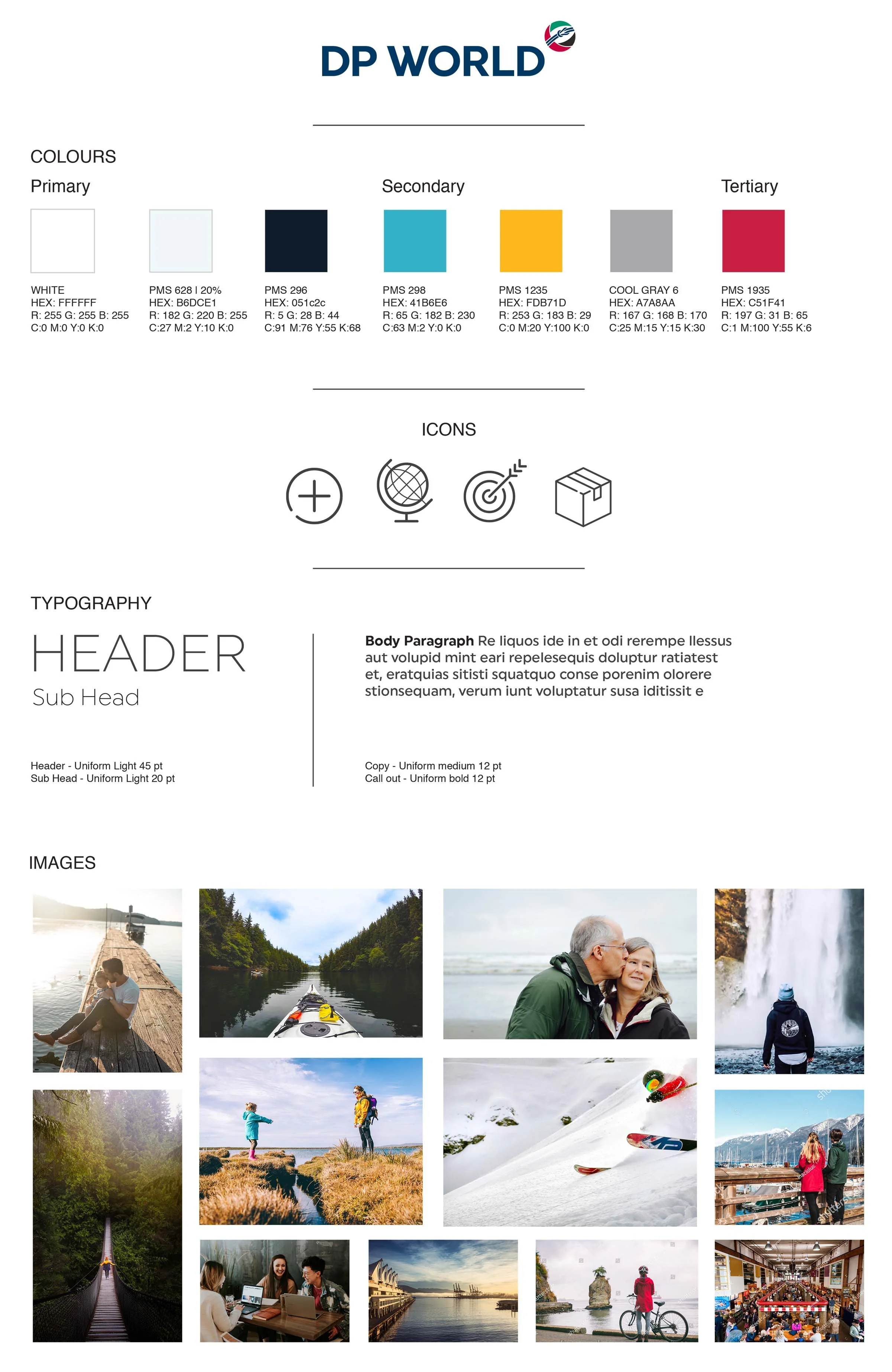
FLAVOUR BOARD
From the beginning of this project, we wanted this website to be bold, confident, simple and strong.
They wanted to be transparent and direct while simple and sophisticated.
Icons were introduced to quickly get information across.
The approved photography style centred around people and nature. They wanted to showcase their infrastructure, but in such a way that blended with nature and put people first.
FINAL UI
Here is the ironed out design with all the finished revisions.


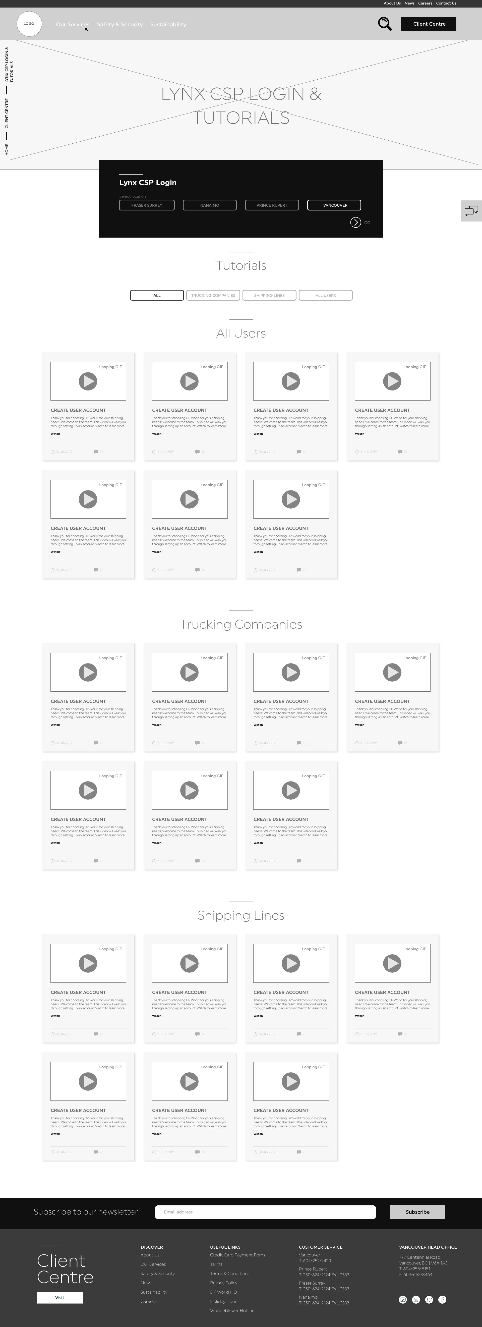
NEWS FILTER SYSTEM
Once the client began to import information, they realized that some information needed to be categorized by location or specified by project.
Here are examples of how this problem was approached.
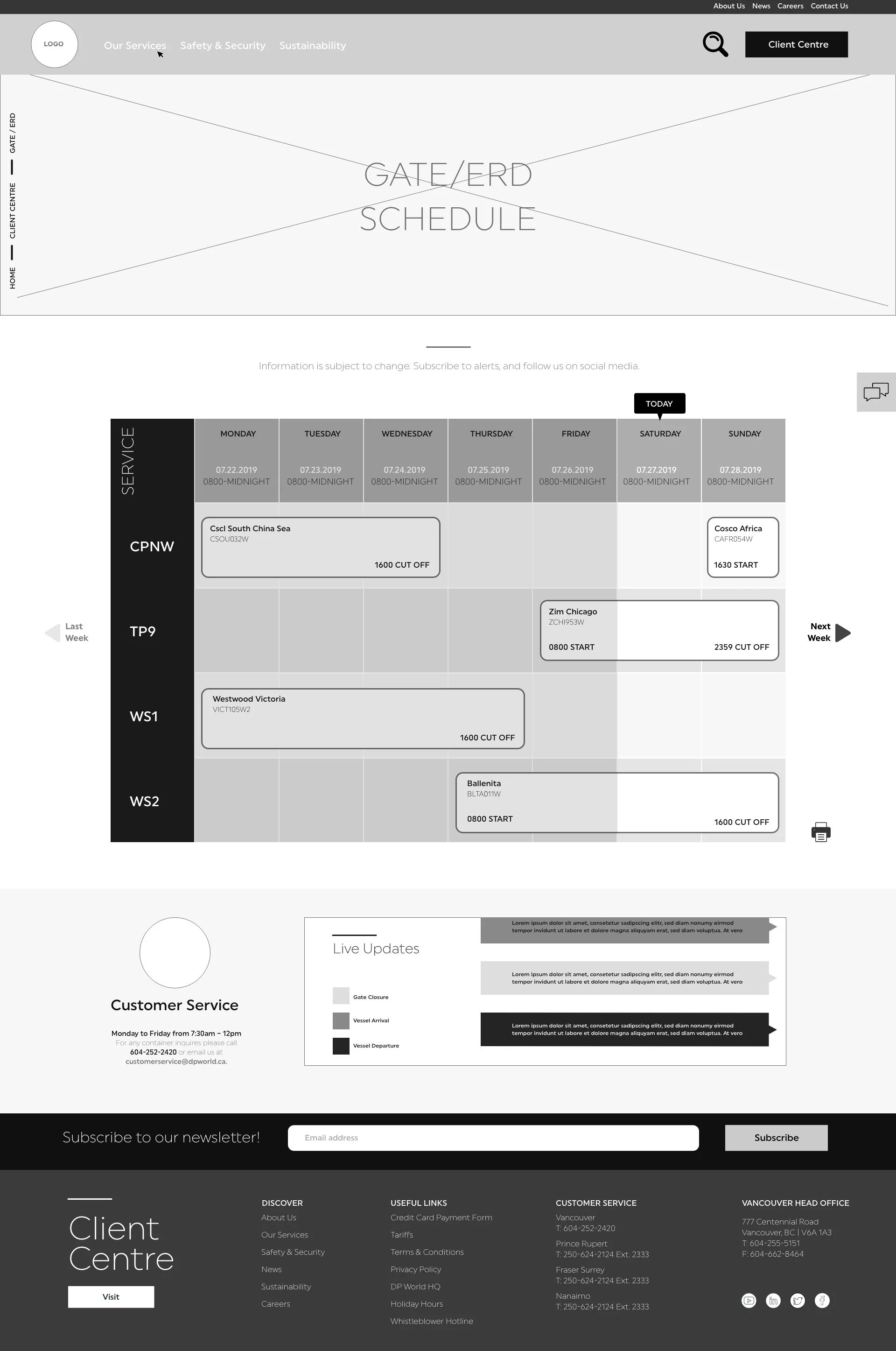
RAIL INFORMATION SCHEDULE
Additionally, the Rail Information page needed to display information chronologically. Here are some layouts how this problem was tackled.
The final design option shows 7 tiles. The user can flip through past weeks to generate their desired schedule. Other options showed a calendar and drop down menu.
Offering the client design options is critical for a successful final design. The client should be happy and approve final designs. Being involved in the design process increases the likelihood of a smooth project.


MOBILE UI
Here is the mobile UI user flow. I took inspiration from the desktop version and didn’t use wireframes for this.


MOBILE FILTER SYSTEM
Here are options how I approached the “Our Services” filtration system on mobile.