

CHALLENGE:
“You don’t know who Badal is” // This cloud mitigation start up didn’t have a brand identity, and an indistinguishable website. The website didn’t elaborate who Badal is and what the company can accomplish.
SOLUTION
Begin by understanding the user persona, professional competition, and industry trends. Using key markers and patterns of user research insights, we begin to create a user flow narrative. The objective is to tell a story that the user can relate to, and engage with. Acting as the project manager, I organized a team of copywriters and developers to bring this project to fruition which directly improved Badal’s online presence and notoriety with their industry.
RESULTS
The website launched on Wordpress and instantly improved Badal’s online presence. Prospective clients are able to understand who Badal is at a glance, and what they are capable of. Users are captivated by the website, because analytics show the session duration is consistently over 1 minute on each page. Additionally, Badal has experienced clients reaching out to the company for collaboration after learning about the company on the website.
Being impressed with my designs and work ethic, Badal continued to use my services for deck design, internal client portal designs, and client mockups. The aforementioned examples are not public, but able to share upon request.
THE LOGO
Badal means cloud in Hindi. Or so I am told by the company’s Chief Cloud Architect. Badal is a cloud mitigation company. Its core objective is to help take clients online and store their data on The Cloud.
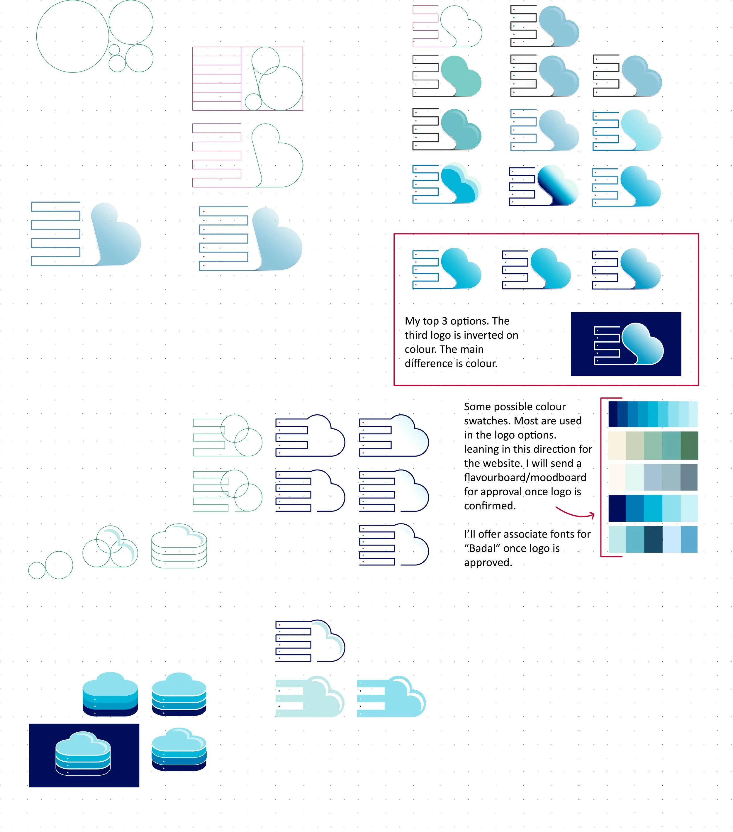
Taking that information, I sought to add a cloud feature to the logo. I began with the “B”, playing with it in a variety of ways. Then tried to spell Badal using BDL, that route was a huge flop as illustrated by, what can only be, a cloud with its nose hanging over a ledge.
My next trajectory was more tech based. I played with a "motherboard” idea, then a server idea. These concepts made it to the first round of deliberations with the company.
The server idea won, and made it to the digital phase using Adobe Illustrator and my trusty Wacom stylist.
I began with the Golden Ratio. God’s perfect mathematical pattern to build structure and shape. After laying a grid down, I got to work building my sketch out. I played with colours and submitted my top three options of the selected logo. The team liked the cloud and server idea, but we agreed this design wasn’t it.
I went back to the drawing board. One thing I didn’t like about the previous design was that I leaned too much on the B. So much so, that it didn’t look much like a cloud. Therefore, that is what I built first. Then, decided to add the “servers” on the bottom so the cloud is sitting on them. It still felt separate. So, I angled the cloud down to make it look like servers in the shape of a cloud.
And, it looks like we’ve got ourselves a winner/gagnant!


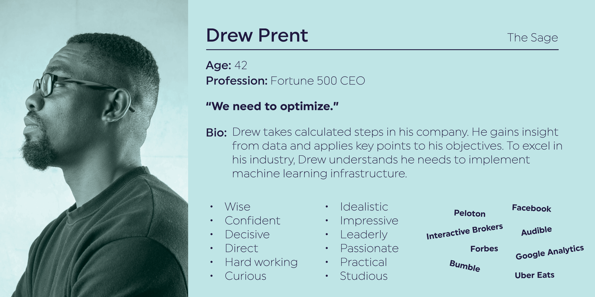
For the user personas, I relied on archetypes and tied it back to the company.
Archetype:
The Rebel: Questions authority & breaks the rules. Badal is disruptive — They help bring companies onto the cloud & customize their cloud server experience. By doing so, they are phasing out current infrastructure.
The Hero: On a mission to make the world a better place. Badal strives for inclusion & offering opportunities.
The Sage: Committed to helping the world gain deeper insight & wisdom. Badal uses machine learning to help clients optimize their cloud server experience.


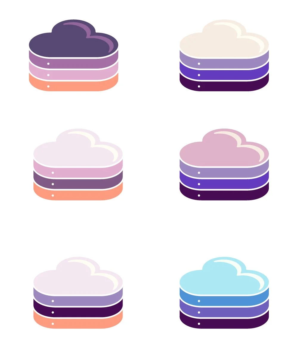
FLAVOUR BOARD
After much research, I realized a lot of Badal’s competitors used blue as their main brand colour. Although I offered them the blue option, I wanted to make the brand standout. I showed them this picture I found. The colours in this storm are absolutely stunning, and completely untraditional. To convince them, I had to sell it.
“Badal is a storm cloud gathering, a force to be reckoned with” I said. It blew the partner’s minds. They loved how different it was, and the story to back it up.
I played with colour combinations and font options. These three were the finalists among 6. We eventually narrowed it down to one. Everyone’s favourite (flavour board 4) is bright, unique, modern and bold.
The next picture shows the organic mood I wanted the website to embody. Being given full reigns of the creative, I wanted to contrast the technological vibe and make it bright and personable. Even though the company is tech based, its culture and people are welcoming, funny, easy going, and throw great parties. Therefore, I felt the website should try to imitate that instead of designing something stiff.
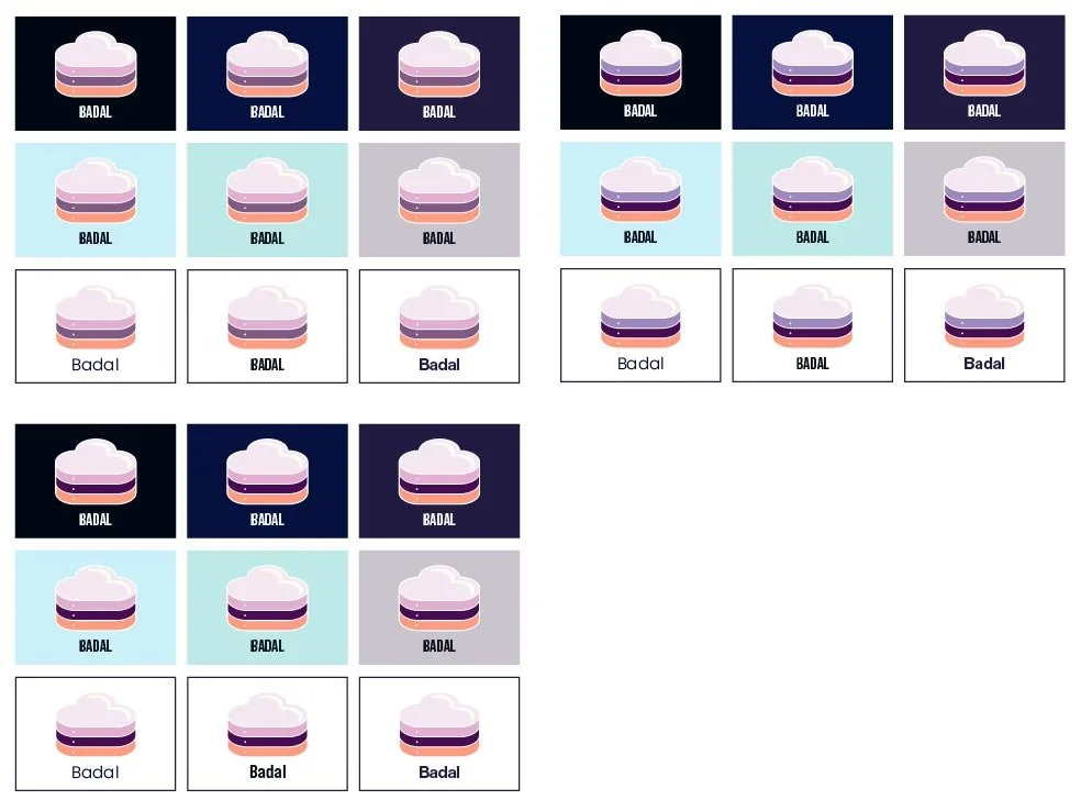
The flavour boards offer the logo displayed on three different background colours including dark, neutral and white. Followed by primary, secondary and tertiary colours featured throughout the site including fun patterns. The title and body fonts are laid out, and completed with a set of images.
The images in flavour-board 1 was a person first theme. Flavour-board 2 showcased technology first. Flavour-board 3 focused a mix of both, but in a corporate mood. Lastly, flavour-board 4 featured a mix of both, but in a personable mood. Overall, this iteration has a fun, personable, techie but quirky design vibe. And, I rolled with it.
The team chose flavour-board 4, and thrilled to begin the next step of the process.
IA + SITEMAP
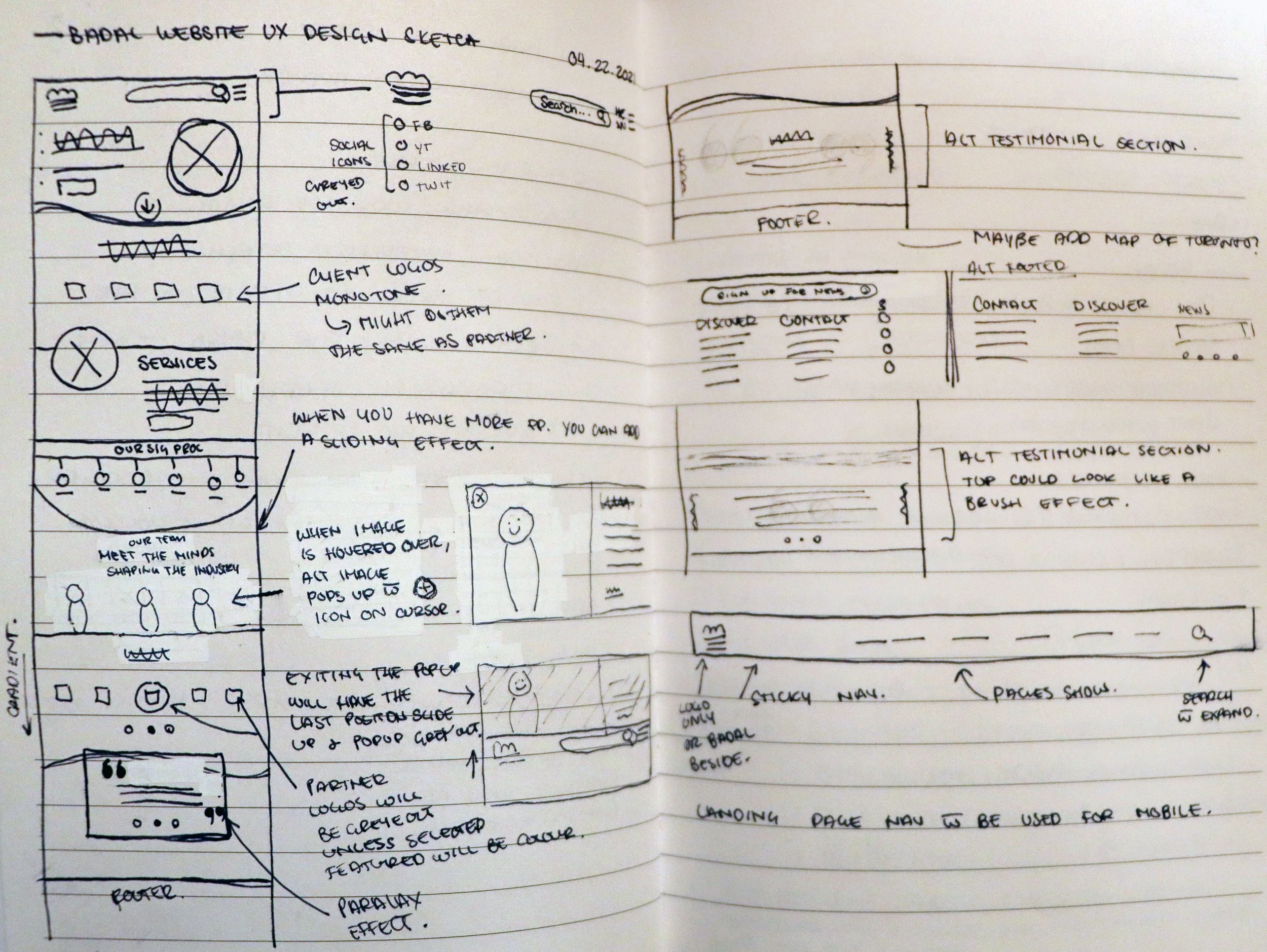
When tasked to build the website, I first needed to iron out what the pages will be and where they will live. Badal’s initial site was just a landing page, and with not much information. I had to dissect what was important and critical to the company, its message, and overall goal of winning new clients.
Recognizing the homepage is the first impression potential clients base their partnership decisions on, it needed to house high level information on important topics — a broad explanation of every subject the website covers. Give the people a little taste, so they come back for more.
As you can see from the preliminary sketch, the information architecture and sitemap is somewhat merged. My mind goes a mile a minute. Though once refined, a roadmap starts to emerge.
The IA breaks down and lists the information associated with each page, and the Sitemap outlines the user navigation through the site including the footer.


THE DESIGN
I sketched out the homepage. With the sitemap complete, I knew what information was needed and where. All I had to focus on now, was the design.
Keeping with the fun, personable, techie but quirky design vibe, I didn’t want a header image. This theme was followed throughout the site. I wanted the intro photo to exemplify the organic, fluid and interesting attitude.
There were obviously some ideas that didn't make it, or evolved. However, the main idea was on paper. I went digital from here, building the design in AdobeXD. The client didn’t want to spend too much time on wireframes, so I delved directly into the combined UX/UI. Since I knew how I wanted the website to function, I skipped the step of having Badal approve the functionality as well.
Please view below to see how the final pages came out.

Home pageFor this project, I acted not only as the lead UX/UI Designer, but also a project manager. I reached out to a few copywriters to collaborate with me on this website.
It was an honour to work with an alum, as I knew their talent and work ethic personally.
With the copy, I was able to hone in on icon designs. I built out the layout from my sketch, added the approved colours, and with a bit of tweaking and finagling, the final product comes to fruition.

About UsThe floating headers is a recurring theme in this design. It feels open, inviting and interactive. Especially when it is used to lead the user below for more content, as exemplified with the zip file icon on the About Us page.
The partners section was designed to be interactive. To showcase this, I animated the function so the developers easily understood the concept.

ServicesOn this page, I wanted to create an interactive way users can read information.
“Solutions to fit your needs” showcases info cards. When the user hovers on desktop or taps on mobile, the card flips.
I created a short animation to explain the function to the developers.

WorkRepeating module designs creates a sense of cohesion throughout the site.
The Case Studies module takes influence from the About Us page.
The option to share is readily available. Clear, bold and descriptive icons give an overview on the associated copy.

BlogsThe blog section comes with a lot of functionality.
Right off the bat, you can see “Article Category” the blogs are able to be filtered through, so users can hone in on the topic of choice.
Once they find their topic, or decide to view all, the user sees a high-fidelity overview of entries.
The entry overview showcases the title, date, length of read, word count, category, views, comments, likes, and most importantly — features. Features explains if the entry is popular, liked, etc., so user is able to quickly discern if they want to read the entry.

Blog TopicThis is an example of a blog entry. It shows all the possibilities regarding entry layout, and what one should expect.
On the side of the entry, users can search this blog, what categories it is listed under, comments they want to share or read, a newsletter call to action, and social links to stay connected.
Related topics are also shown at the bottom of the blog to entice the user to stay on the site, and read more.

CareersThe career page is simple but interesting.
I love using icons to explain a topic. As a visual person, the combination helps to quickly explain what the topic is about.
The job description tiles are similar but unique. Much like the rest of the website. The design leans on the blog overview tile. Though, obviously, it has its own personality.
The brands section is taken from the homepage and utilized here because it has value. The prospective applicant could love or hate these brands, and ultimately affect their performance.
The design of this section is a looping cycle that features the main logo in colour and the rest monochrome. That way, the website looks less cluttered.

Job PostingThe job posting layout is again leaning on the “About Us” page and “Case Studies” modules.
A cheeky feature I added here is the “X” at the top right of the job description.
The user can simply go back to the previous page or click the “X”. The page then reverts back to the list of open positions.

ContactLastly, the contact us form follows the same design throughout the website.