CHALLENGE:
“Our customers need to know about the new exciting things 7-Eleven has to offer!” // In addition to their desire for a facelift, 7-Eleven now offers deliveries. The store carries a plethora of snack options, filled with culturally diverse options and classic favourites. However, not everyone knows this.
SOLUTION:
Understand the user, and identify what is important to them. By offering 7-Eleven as a solution to their needs and wants, the store can be top of mind for the target market. By focusing on delivery, users don’t need to worry about inconveniencing themselves.
RESULT:
Designed a website that is delivery focused, and has a fresh face with the same quirky personality. The user flow became more streamlined with the delivery objective in mind. After the redesign analytics showed users would increasingly visit the menu and delivery pages, and session durations would consistently exceed 1.5 minutes per page.
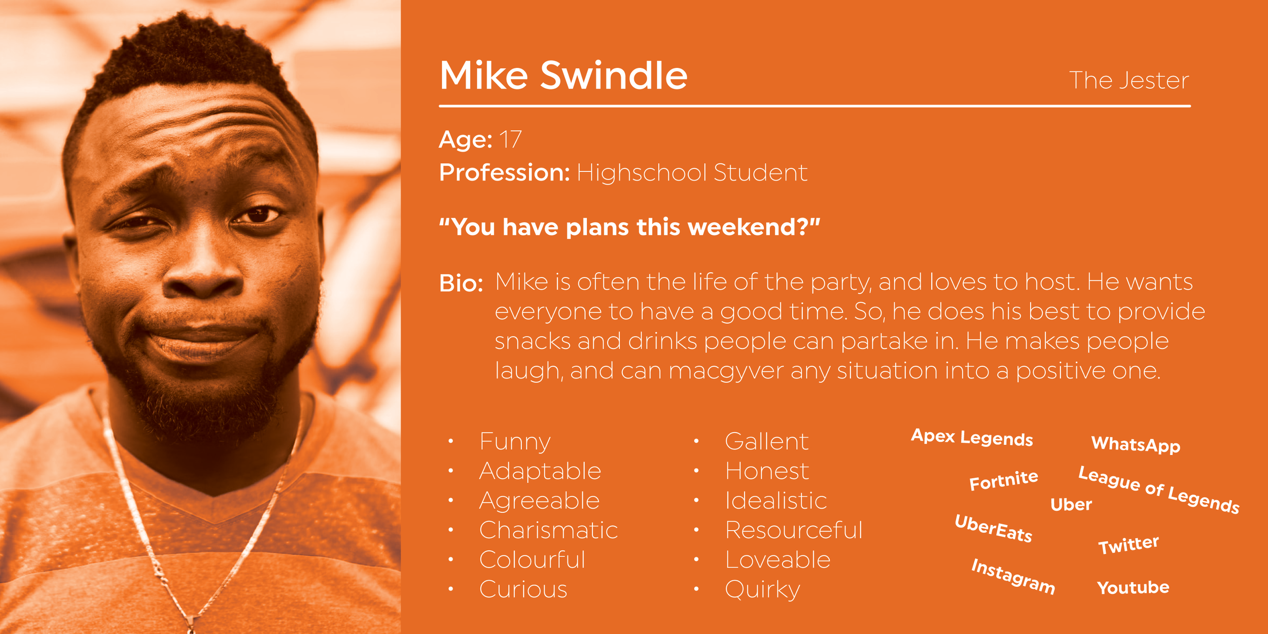

For the user personas, I relied on archetypes and tied it back to the company.
Archetype:
The Jester: Brings joy to the world through humour, fun, irreverence, & mischief. 7-Eleven has a quirky personality & attracts similar people.
The Explorer: Finds inspiration in travel, risk, discovery & thrill of new experiences. 7-Eleven offers food & delivery, the vast menu surprises people. Stores offers international snacks as well as traditional.
The Everyman: Seeks connection and belonging; is recognized as supportive, faithful & down to Earth. 7-Eleven welcomes anyone to taste their slurpee. It offers opportunities to everyone & culturally diverse menu options.


SITEMAP
Using a template I made in Visio, the 7-Eleven sitemap and information architecture takes shape.
The site’s content and information is broken down into a global navigation, site content audit — including navigation pages, consumption pages, interactive pages, and external links.
The sitemap was proposed in two different ways. A solitaire global nav, or an alternative being in combination with a utility nav.
The last two images are the finalized global nav and footer. As you can see, this sitemap went through different iterations before we were satisfied with it.
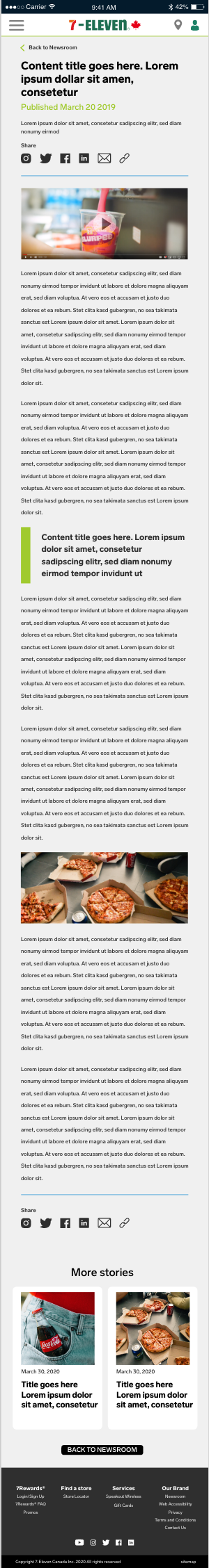
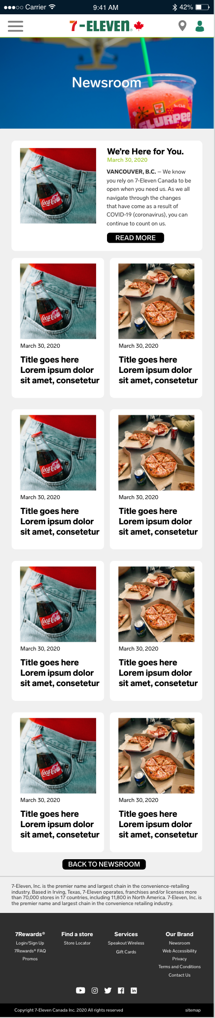
THE DESIGN
Home PageInvision is an excellent tool to create mockups, and prototype designs.
While the wireframes were on Invision, the UI was presented in Adobe XD. I wanted to work with both programs, and determined their pros and cons.
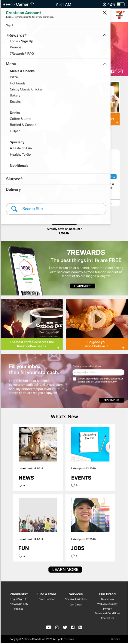
Check out the before and after of the homepage! After much deliberation of final designs, the homepage maintained the core of the wireframes.

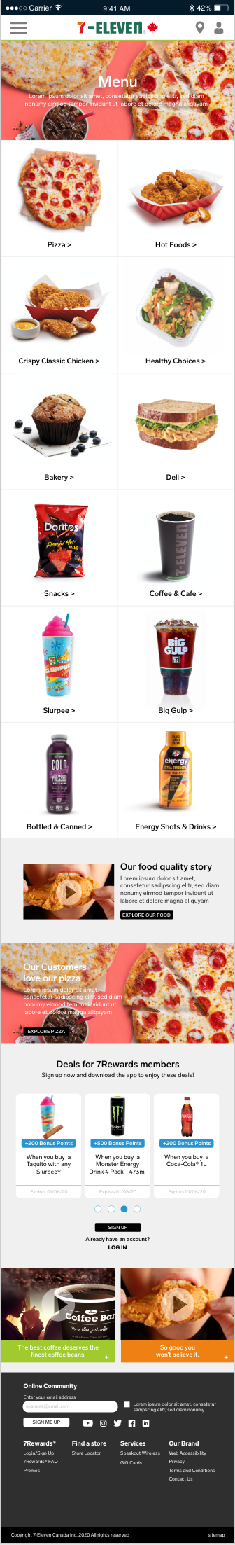
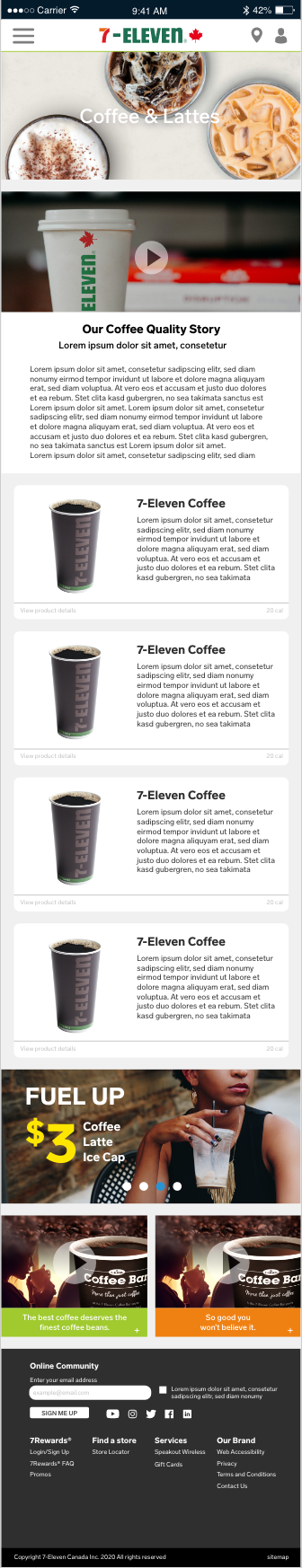
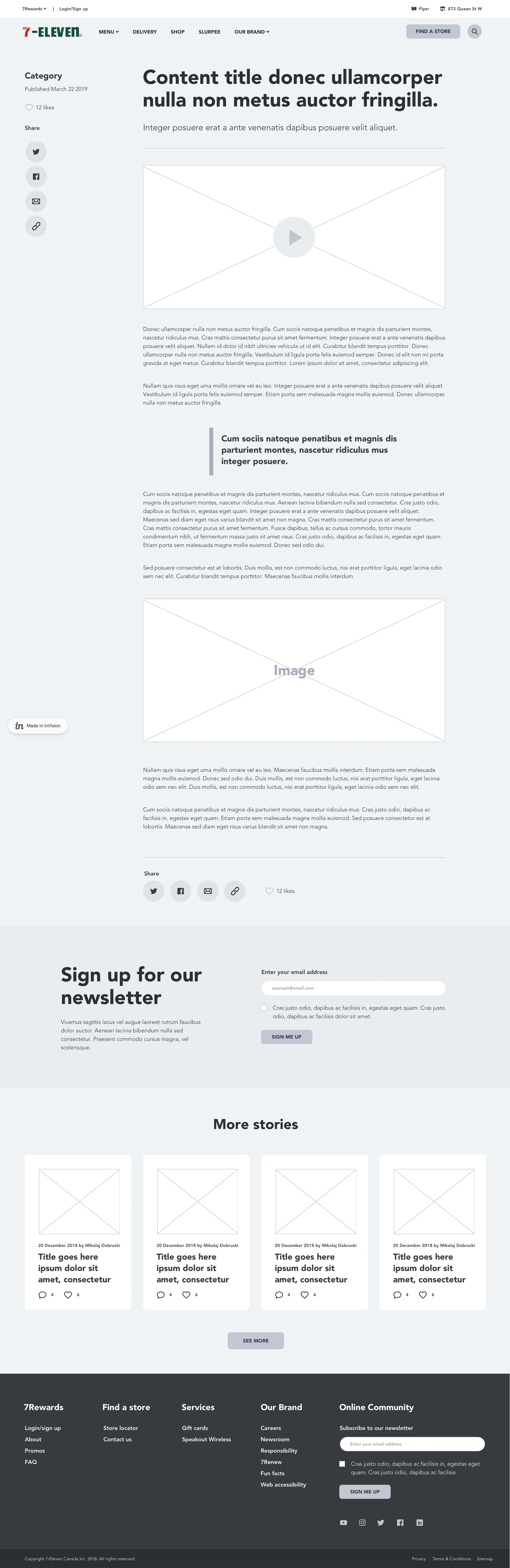
Menu PagesThe spirit of the wireframes remained the same.
The menu landing page kicks off with an overview gallery of the menu. Users can quickly glance at the photos to determine what they want to select.
I wanted to bring the company’s colourful personality to the design. Therefore, you’ll see a lot of colour throughout the site.
The client wanted more real estate for the promos. Therefore the design was updated. I copied modules styles from other pages to maintain overall cohesion. Most of the repeated modules show promos and other website content designed to keep the user on the site.


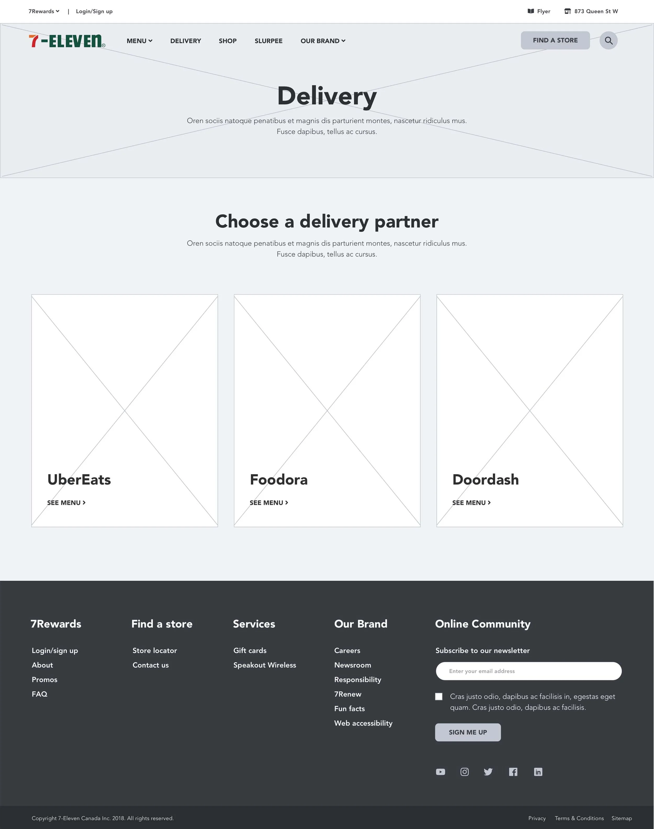
Delivery PageWhile building this page, we realized that some apps don’t deliver to certain addresses.
If a user downloads one of these apps, they could be annoyed to find themselves unable to order their 7-Eleven.
To remedy this, I designed a search feature. When an address is inputted into the system, the algorithm will scan all delivery apps to validate the delivery option.


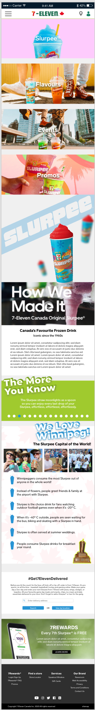
Slurpee PagesThe client decided the wireframes didn’t showcase the fun personality of what the Slurpee brand is.
I decided to add a parallax feature: The floating cups covering “Slurpee” designed in two ways.
New information was added late into the design, and therefore had to update the overall layout of these pages.
For the Slurpee flavours wireframes, we included a cycle feature where users can select a flavour, and they can see it in a cup. Unfortunately, this feature wasn’t incorporated due to limited product photography at the time.


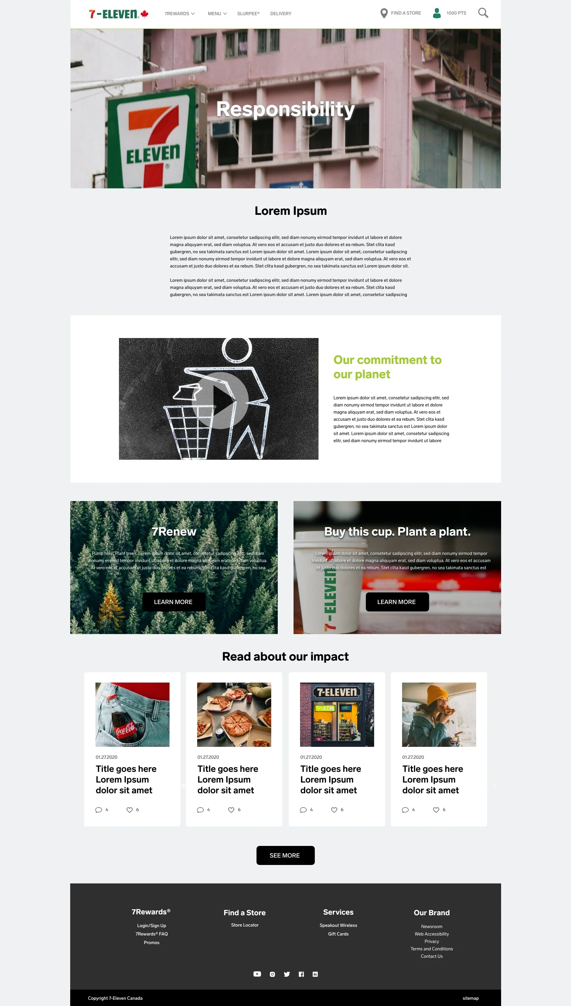
Brand PagesFor Our Story we decided to incorporate a timeline feature where users can click through significant dates in 7-Eleven’s history.
Incorporating repeated modules throughout the design allows the project to remain cohesive.
For the UI, I wanted to add a sense of history to these pages. 7-Eleven is an established brand in North America, therefore these images tried to portray that. Especially with Our Story, Responsibility, Careers, and Story images.
Since millennials are their target demographic, research shows they are very nostalgic people. Imitating that in photography has a powerful impact, especially for this demographic.


Store PagesWe wanted to make it easy for customers to find not only their closest location, but a location that best fit their needs.
I delved deeper into this filter feature in the UI.


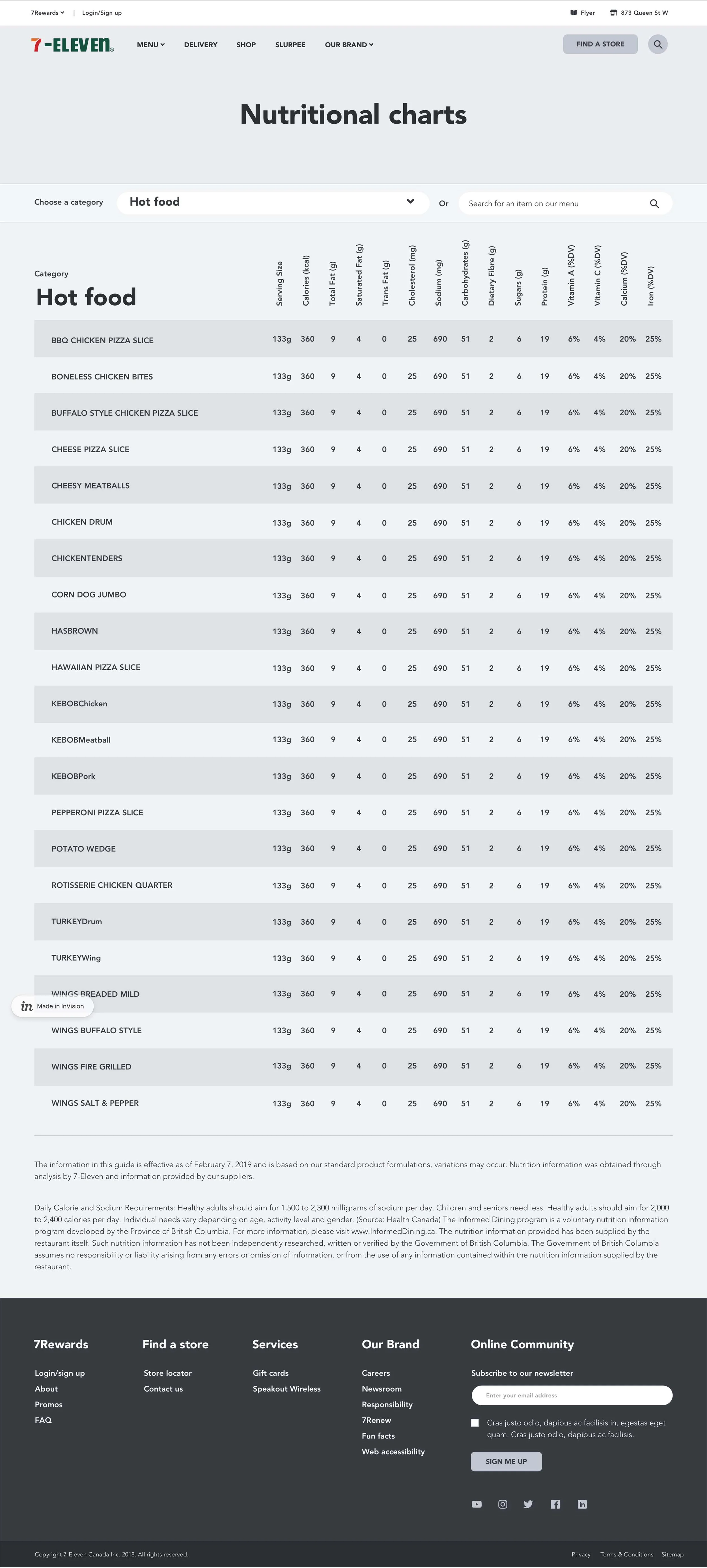
Nutrition PageAs per North American Health Guidelines, nutritional information must be displayed.
7-Eleven serves a great deal of menu options, therefore this chart must show a lot of information.
To make things easier for the user, there is a search feature. You can search by category, or a specific item.

Mobile LayoutsThe mobile layouts were scaled down using the desktop version as a template. No wireframes were designed for these screens.